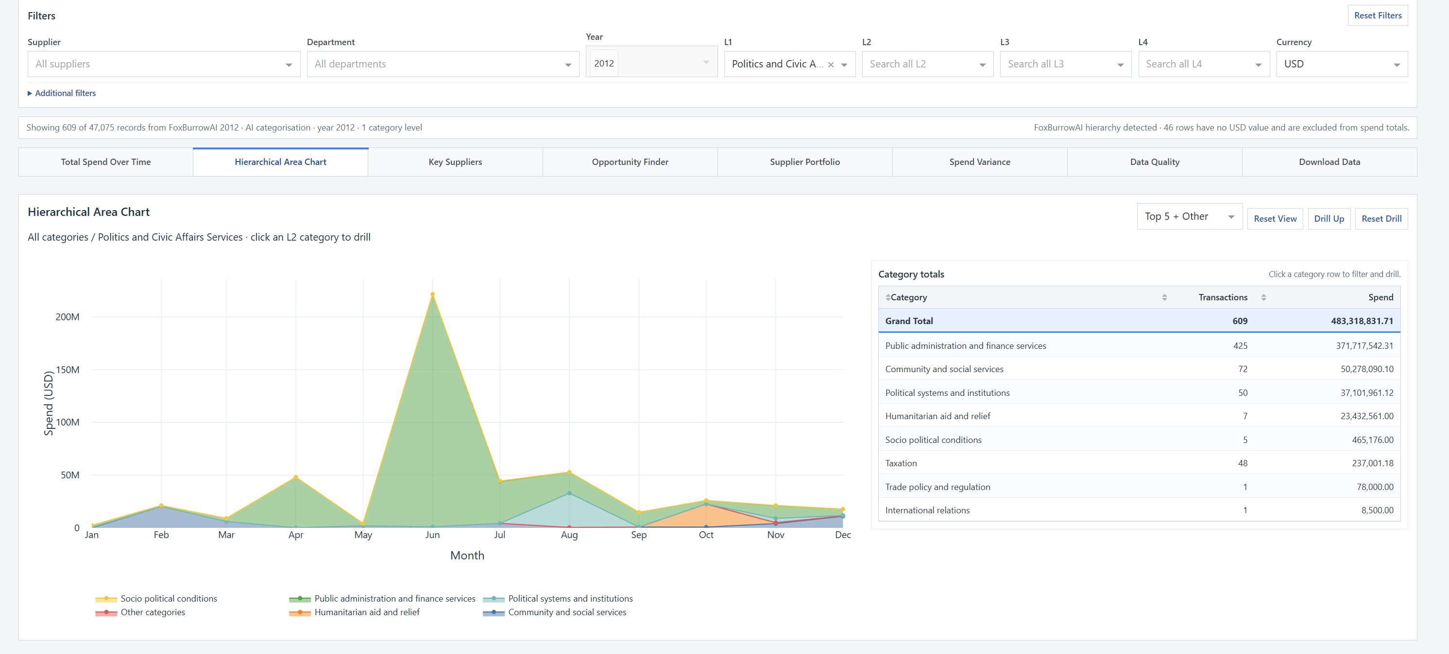
Hierarchical Area Chart
Drill from broad L1 categories through the detailed taxonomy by clicking either the chart or category-total table. The visible filters follow the drill path and can be stepped back or reset.
Open full-size screenshot ↗Explore 47,075 public-sector procurement records using either the government’s original human-assigned categories or FoxBurrowAI’s independent AI categorisation. Every worksheet shares the same filters, turning a static spend file into a connected analytical workspace.
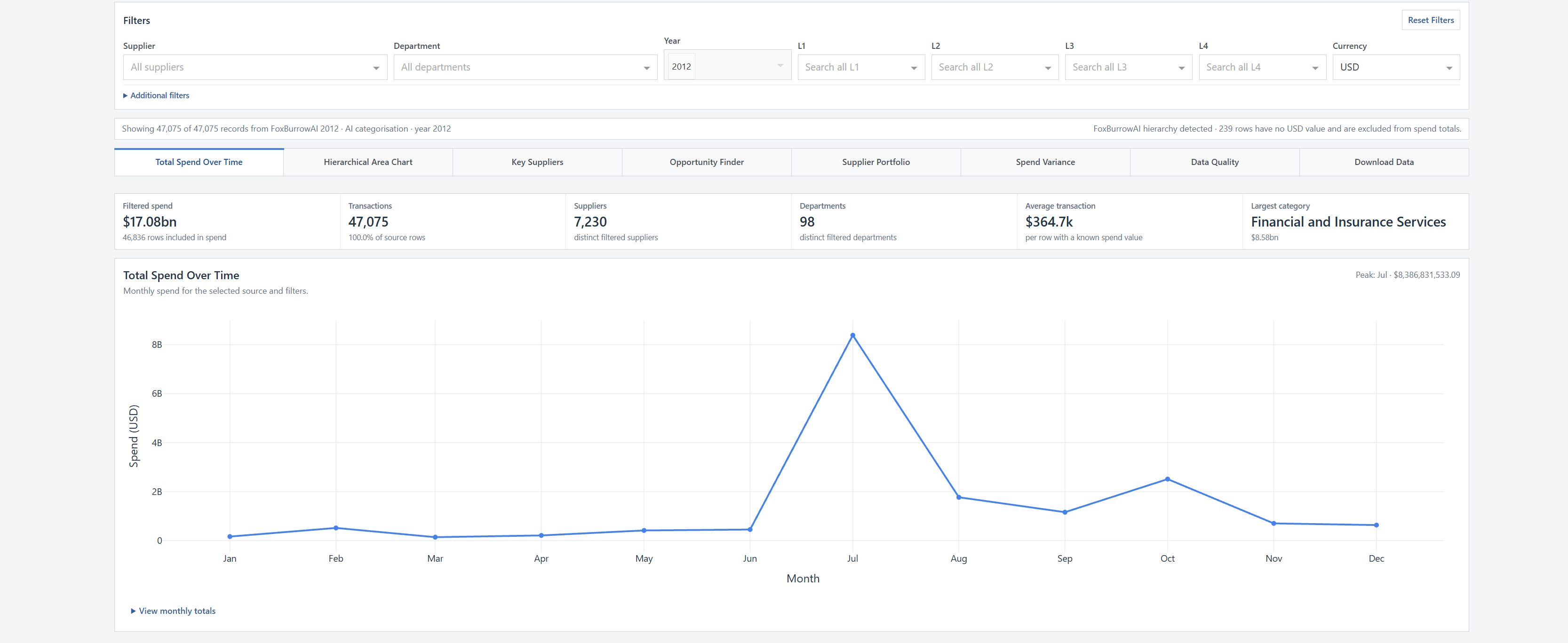
Supplier, department, date, category and currency filters flow through every view. Summary metrics update alongside the charts, so the scale and context of the filtered population stay visible.
Follow monthly spend, identify peaks and retain a clear KPI summary of transactions, suppliers, departments and average transaction value.
Charts and tables are designed to work together. Selecting a category or supplier updates the shared filters, while reset controls make it easy to return to the broader view.
Drill from broad L1 categories through the detailed taxonomy by clicking either the chart or category-total table. The visible filters follow the drill path and can be stepped back or reset.
Open full-size screenshot ↗
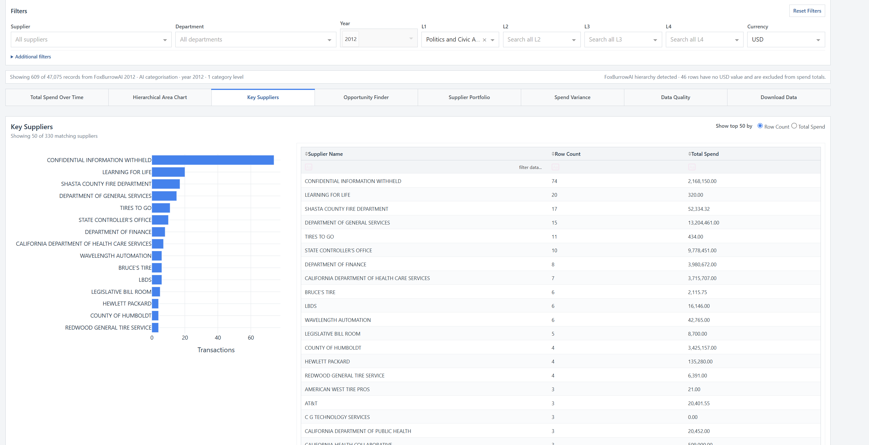
Rank suppliers by transaction count or observed spend, compare the visual distribution and search the detailed table to inspect the organisations driving the selected category.
Open full-size screenshot ↗Four additional worksheets add concentration analysis, supplier-category exposure, period variance and explicit data-quality checks. Each includes a collapsible dashboard explanation describing how to interpret it.
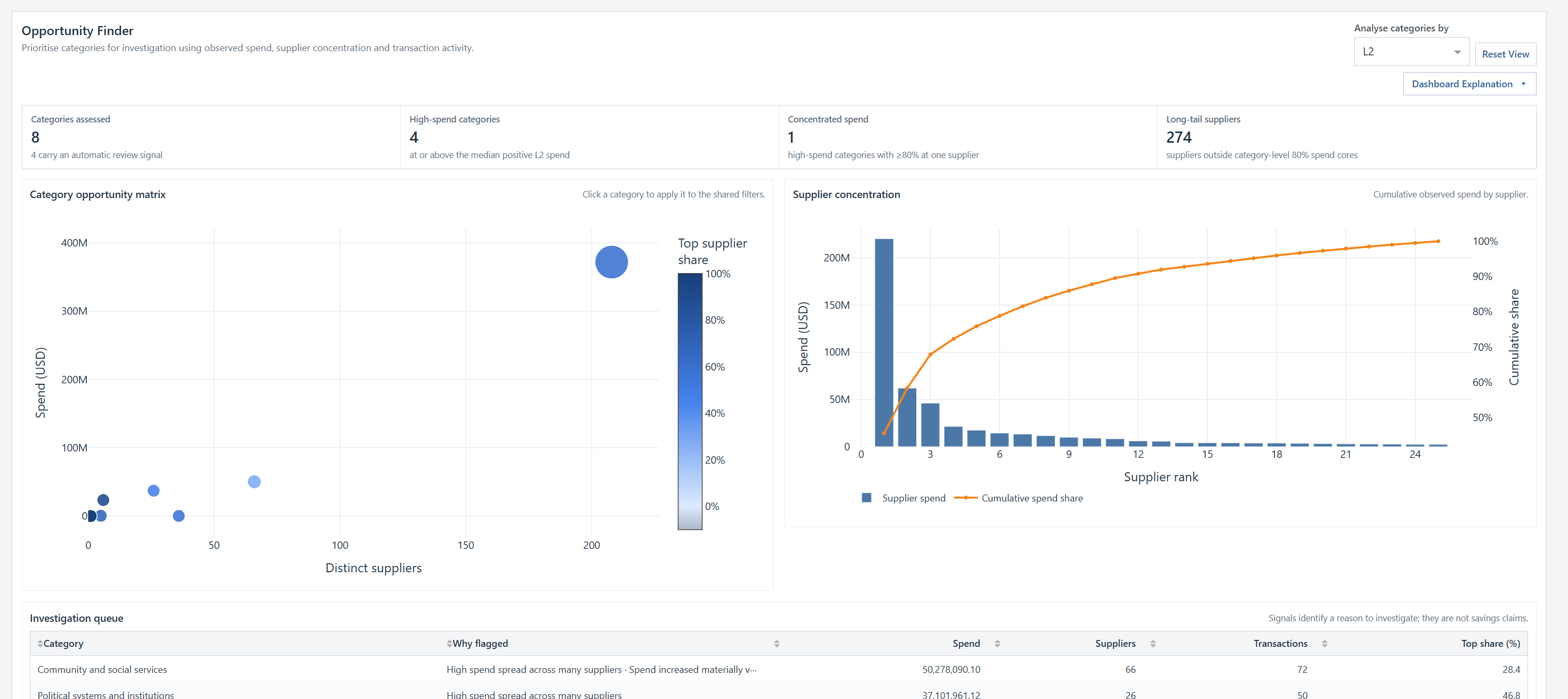
Compare category spend, supplier breadth and top-supplier share, then examine the concentration curve and evidence-based review signals in the investigation queue.
Open full-size screenshot ↗
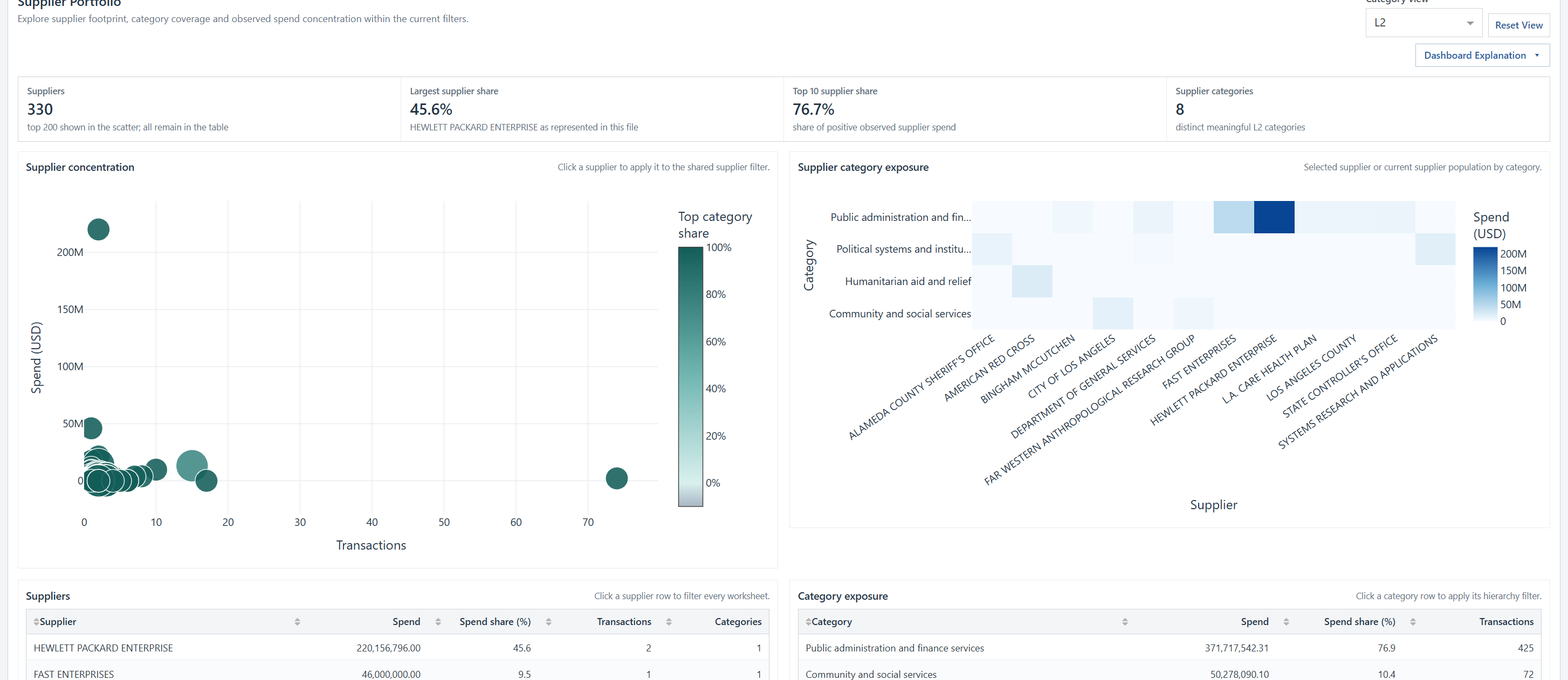
Explore supplier footprint and concentration in a scatter plot, then use the exposure heatmap to see which selected categories are represented across the supplier population.
Open full-size screenshot ↗
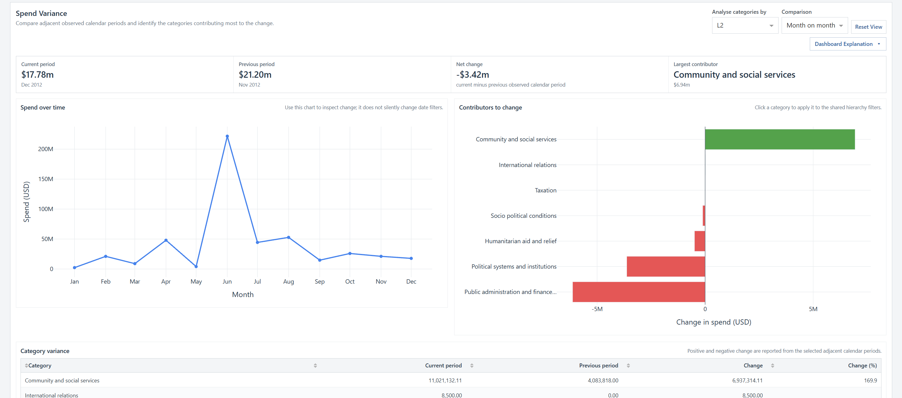
Compare adjacent months or quarters, quantify the net movement and identify the categories contributing most to increases and decreases without silently changing the shared date filters.
Open full-size screenshot ↗
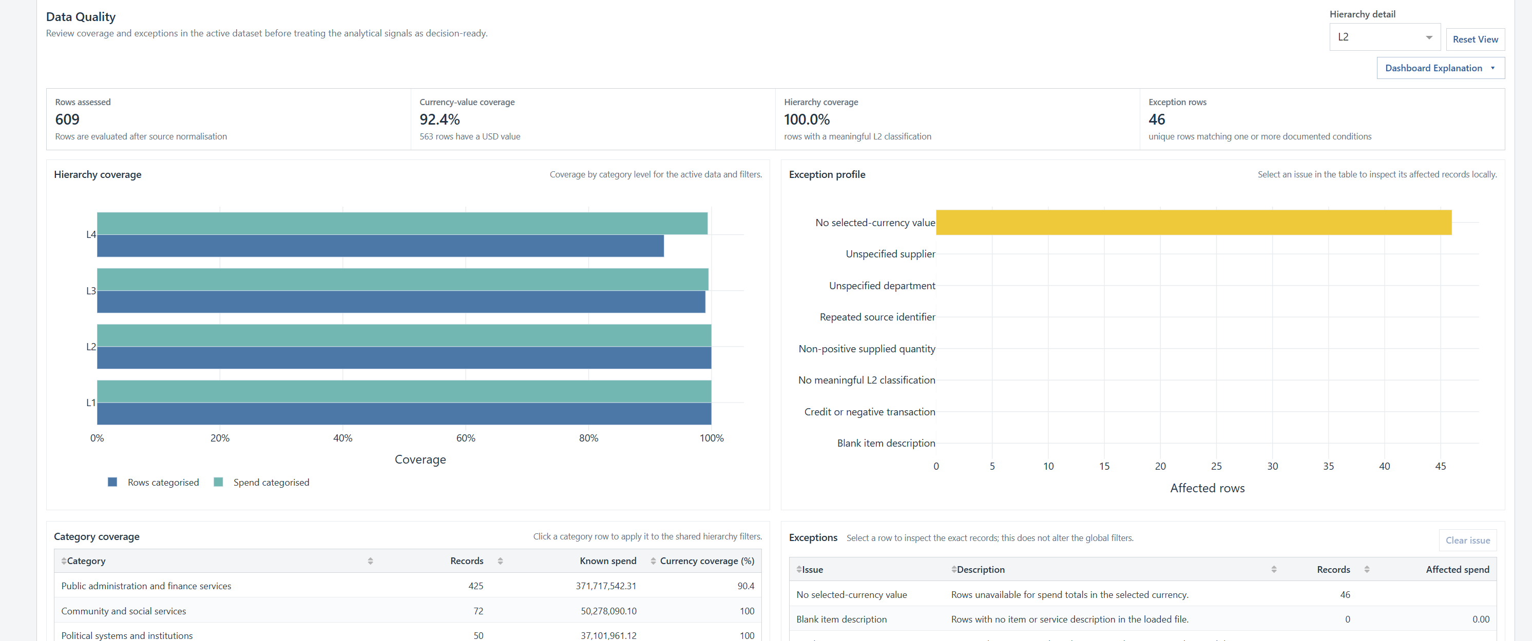
Check currency-value coverage, hierarchy completeness and documented exception types before treating analytical signals as decision-ready. Select an issue to inspect its affected records locally.
Open full-size screenshot ↗The combined demo is designed to make the classification difference inspectable rather than presenting it as a black-box claim.
Every view and interaction is available for both verified versions.
The original public-sector procurement records using the government’s supplied human-assigned categories.
The same procurement records independently categorised by FoxBurrowAI, without guidance from the original labels.
The public source data and detailed classification examples remain available for independent review in Excel or compatible tools.
Client editions can be delivered with one or more verified datasets locked to the package, while keeping the source data on the recipient’s machine.